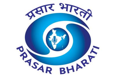
The elements in the central circle and map of India signify the service of trust, security and perfection to the Nation, its colour, ‘Dark Moderate Blue’ represents both the sky and the sea and is associated with open spaces, freedom, intuition, imagination, inspiration, and sensitivity
 KRC TIMES Desk

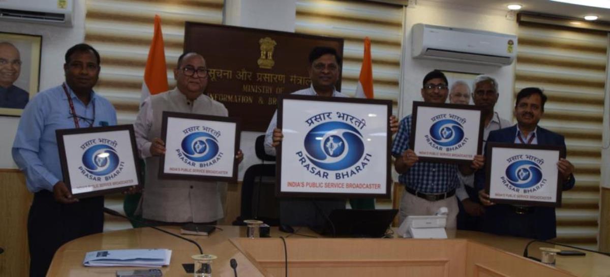
Prasar Bharati India’s public broadcaster unveiled its new logo on 11th July 2022 & with that added a new chapter in its glorious history.
The new logo was released by Secretary I&B Apurva Chandra, in the presence of CEO Prasar Bharati Mayank Kumar Agrawal, Prasar Bharati, Member (Finance) DPS Negi, and senior officers of Ministry of I&B and Prasar Bharati.
The new logo of Prasar Bharti is replete with rich meaning. In the new logo symbol for Prasar Bharati, an autonomous statutory body under the Ministry of Information & Broadcasting, the elements in the central circle and map of India signify the service of trust, security, and perfection for the common man. The organization started as All India Radio (AIR) in the past and Doordarshan (DD) was born to cater television services later and finally came Prasar Bharati (PB) by enactment of an act by the parliament, which is visualized in the logo identity as emerging and evolving from the centre.

While the elements in the central circle and map of India signify the service of trust, security and perfection to the Nation, its colour, ‘Dark Moderate Blue’ represents both the sky and the sea and is associated with open spaces, freedom, intuition, imagination, inspiration, and sensitivity. Blue also represents meanings of depth, trust, loyalty, sincerity, wisdom, confidence, stability, faith, and intelligence. The colour blue also pays tribute to the Indian ethos and traditions associated with religious figures, mythological characters found in the Indian miniature paintings.
On the occasion of unveiling of the new logo, Prasar Bharti’s Member (Personnel) DPS Negi opined that in the earlier format, the corporate office of Prasar Bharati used both AIR and Doordarshan logos on both the sides of the written text ‘PRASAR BHARATI’ along with the Indian emblem in the middle. Inspired from the identities of both AIR and Doordarshan, the new logo of Prasar Bharati is defined as a blend of both AIR and Doordarshan. It not only encloses the elements from their visual identities, but it also leverages their colour combinations, to complement the identity of PB as a public service broadcaster.
Headquartered in New Delhi, Prasar Bharati is a statutory autonomous body set up by an Act of Parliament. It comprises of the Doordarshan Television Network and All India Radio (AIR), which were earlier media units of the Ministry of Information & Broadcasting.
Advertisements | 5E For Success

KRC Career Membership Program is the first step toward an evolved career-building support system powered by KRC Foundation. Ideal for students and job seekers. Mail resume to- 5eforsuccess@gmail.com


